Styling web applications has become more complicated over the years. In the early days of web development, the .css file was responsible for styling the UI via selectors. Then, libraries like Bootstrap introduced a few utility classes that developers could apply to their HTML elements instead of writing them from scratch.

Eventually, Tailwind came along with an extreme approach, providing a single utility class for every atomic style that you’d want to apply to your element. Occasionally, this led to a lot of .classes being applied to a single element. When building small to medium-sized applications, we rarely need that level of customization.
Here, Pico CSS comes into the picture. In some ways, it is the anti-Tailwind library. Pico CSS discourages using a large number of .classes in your application. Instead, it styles the semantic HTML elements in such a way that you don’t need to write a lot of code yourself.
In this article, we’ll explore Pico CSS in-depth by building a React app with dark mode and custom theming support. Let’s get started!
Jump ahead:
- What exactly is Pico CSS?
- Layout support in Pico CSS
- The .container class
- The .grid class
- Other common components: Inputs and buttons
- Special components with semantic HTML
- Dropdown
- Accordion
- Modal
- Getting hands-on with React and Pico CSS
- Setting up the navbar
- Adding list items
- Final touches
- Dark mode support
- Theming
What exactly is Pico CSS?
According to its homepage, Pico is a minimal CSS framework for semantic HTML. Pico styles the built-in HTML elements so that when you’re building a small app, you don’t need to write a lot of custom CSS.
This doesn’t mean that Pico CSS is limited in terms of its capabilities. Rather, it is packed with features like dark mode support and custom theming out of the box.
Layout support in Pico CSS
Building proper, responsive layouts forms an integral part of app development. Pico CSS helps us to achieve this with the help of the .container and the .grid classes.
The .container class
We can use the .container class to center content in the main part of our application. For example, the code below will center the inner content:
export default function App() { return ( <main className="container"> <h1> React ⚛️ + Vite ⚡ + Replit 🌀 </h1> </main> )}Pico also sets pre-configured breakpoints, which are similar to Bootstrap, that help to distinguish between devices based on their screen sizes. The font sizes and viewport size are modified automatically depending on what device is being used.
The .grid class
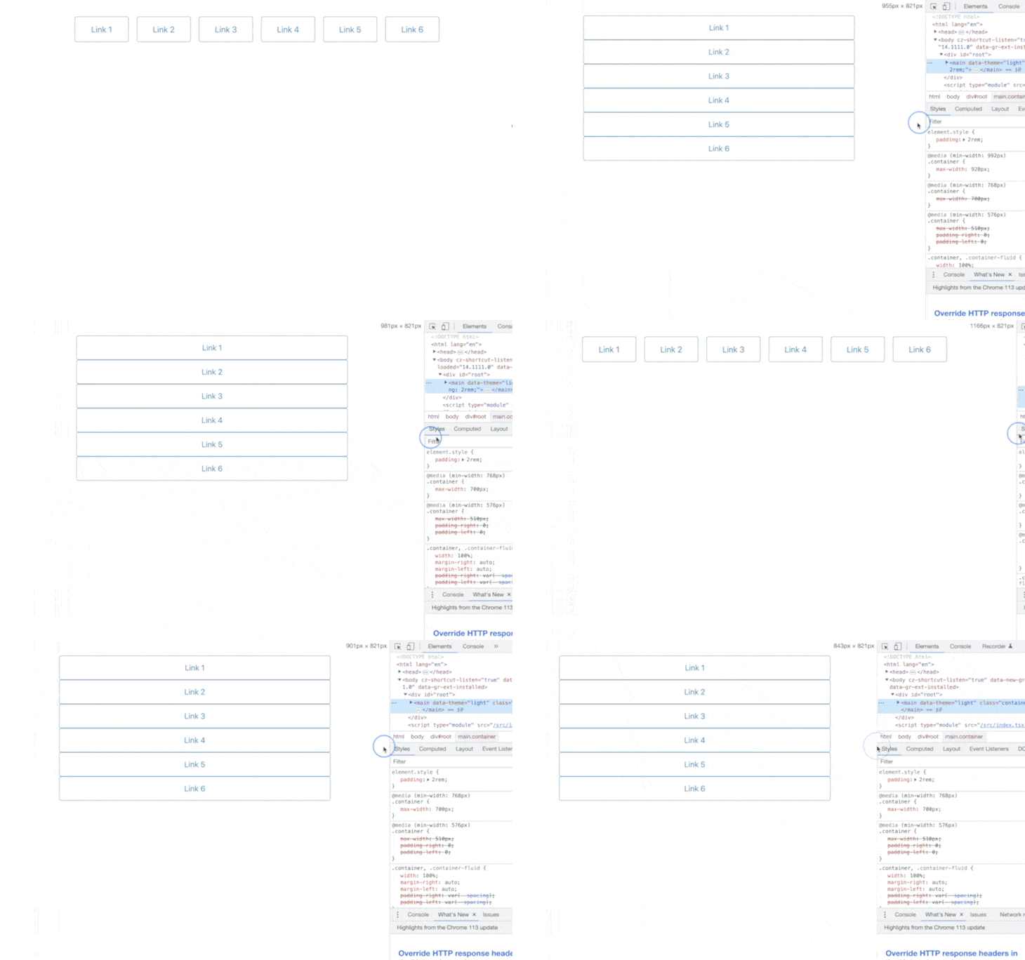
Pico’s grid system is quite interesting. To set it up, we need to apply the .grid class on the parent div as follows:
<div class="grid"> <a href="#" role="button" class="outline">Link 1</a> <a href="#" role="button" class="outline">Link 2</a> <a href="#" role="button" class="outline">Link 3</a> <a href="#" role="button" class="outline">Link 4</a> <a href="#" role="button" class="outline">Link 5</a> <a href="#" role="button" class="outline">Link 6</a></div>
Pico ensures that these links are rendered in a row layout on large devices, and it automatically switches to a column layout when the viewport size is smaller than 992px. This will look like the following:
Other common components: Inputs and buttons
In addition to the layout components above, Pico CSS also provides basic components like buttons and input elements. Let’s create an input component followed by two buttons that we‘ll use in our final to-do app:
<div class="grid"> <input type="text" id="newitem" name="newitem" placeholder="Add an item to list" required /> <div> <button>Add item</button> </div></div>
In the code above, we created a grid component that contains two items laid out side-by-side. The first is an input that will accept whatever the user types in, and the second is a button that will add the item to the list:

You can style buttons in different ways, like primary, secondary, contrast, and outline:

Now that we’ve covered the most common components, let’s review some special components.
Special components with semantic HTML
When we use React components, we tend to use customized components to provide certain functionality like dropdowns, modals, etc. But, we can achieve all this easily using semantic HTML elements, which Pico CSS provides styling support for out of the box.
Dropdown
The dropdown is an important component that helps us to take and store input from the user. You can easily achieve a dropdown with the help of the <select> and <option> HTML semantic elements:
<select onChange={e => console.log(e.target.value)} value={fruit}> <option value="apple">Apple</option> <option value="mango">Mango</option> <option value="banana">Banana</option></select>In the example above, we have a dropdown with three options. Whenever we change the value of the dropdown, the onChange handler gets triggered, and the value prop passed to each of the options is passed to the handler as e.target.value. Additionally, the value prop passed to the select element decides what option is selected in the dropdown:

Accordion
Another fairly complicated component is the accordion. The accordion component displays a list of items, and clicking on one of the items expands it to show more details. To create an accordion component, we can use the <details> and <summary> elements from Pico CSS.
The summary shows up as the title for the minimized accordion. Anything outside of the summary and inside details will show up when it is maximized:
<details> <summary>Accordion 1</summary> <p>This is the first accordion</p></details><details open={true}> <summary>Accordion 2</summary> <p>This is the second accordion</p></details>Also, notice the open prop passed to the details component. This keeps the particular accordion open by default:

Modal
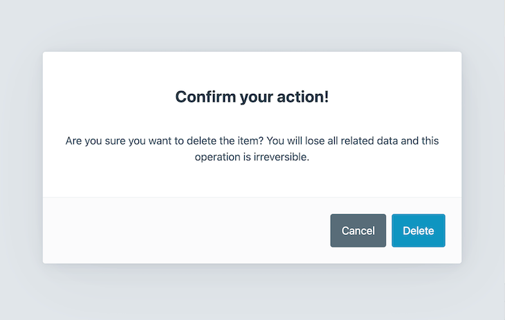
A modal is another important component that is fairly difficult to implement. A modal appears on top of the main content and presents some additional context to the user. In Pico CSS, we can create a modal with the help of the <dialog> semantic element:
<dialog open={true}> <article> <h3>Confirm your action!</h3> <p>Are you sure you want to delete the item? You will lose all related data and this operation is irreversible: </p> <footer> <a href="#cancel" role="button" class="secondary">Cancel</a> <a href="#confirm" role="button">Delete</a> </footer> </article></dialog>The text inside of the h3 tag shows up as the modal title. The text inside the p tag shows up as the modal content. The footer tag hosts the action buttons for the modal. The modal can be shown and hidden by passing true and false values to the open prop, respectively. The modal above shows up in the open state as follows:
Getting hands-on with React and Pico CSS
Now that we’ve discussed the various components provided by Pico CSS, let’s build a simple to-do app with React and Pico CSS. We’ll use a few of the components discussed above. You can follow along with this tutorial or check out the final result in this Repl.
Setting up the navbar
First, let’s add a navbar to our app:
<nav> <ul> <li><strong>Todo list</strong></li> </ul> <ul> <li><a href="#" role="button" class="outline secondary">Toggle dark mode</a></li> </ul></nav>
We’ve implemented a simple navbar using the semantic nav element and provided unordered lists for the left and right side items. On the left, we just have the name of the app, while on the right, we’ve added a placeholder button for implementing dark mode, which we’ll come back to later.
With the changes from the previous sections, our app now looks like the following:

Now, we’ll add the list items and make the app functional.
Adding list items
We already have the input and button components, so let’s move to the implementation of the list items. We’ll keep all the list items inside a div, assign it the class list-container, and create each of the list items as a div with the class list-item.
Note that Pico CSS doesn’t discourage us from using classes as long as we don’t go overboard with it. The JSX for the list items looks like the following:
<div className="list-container"> {items.map(item => <div className="list-item" key={item.id}> <span style={{textDecoration: item.done ? 'line-through' : 'none', fontSize: '1.5rem'}}>{item.label}</span> <div> <a href="#" role="button" id={item.id} className="outline" onClick={(e) => checkItem(e)}>done</a> <a href="#" role="button" id={item.id} className="outline secondary" onClick={(e) => deleteItem(e)}>delete</a> </div> </div> )}</div>Below are the two CSS styles:
.list-container { display: flex; flex-direction: column; align-items: flex-start;}.list-item { display: flex; width: 100%; flex-direction: row; justify-content: space-between; align-items: center;}We’ve provided two actions for each of the list items, done and delete. The done action strikes through the text of the list item, and the delete action deletes the item from the list. The following functions handle that behavior:
const checkItem = e => { let item = items.find(item => item.id == e.target.id); item.done = true; setItems([...items]);}const deleteItem = e => { let index = items.findIndex(item => item.id == e.target.id); items.splice(index, 1); setItems([...items]);}Final touches
Finally, to wire everything up, we create a new variable to hold the value of the previously created input field and add a new item to the list when the button is clicked:
<input type="text" id="newitem" value={newItem} placeholder="Add an item to list" onChange={(e) => setNewItem(e.target.value)} /><div> <button onClick={() => addItem()}>Add item</button> </div>The function below generates a random ID for each item and adds it to the list of items:
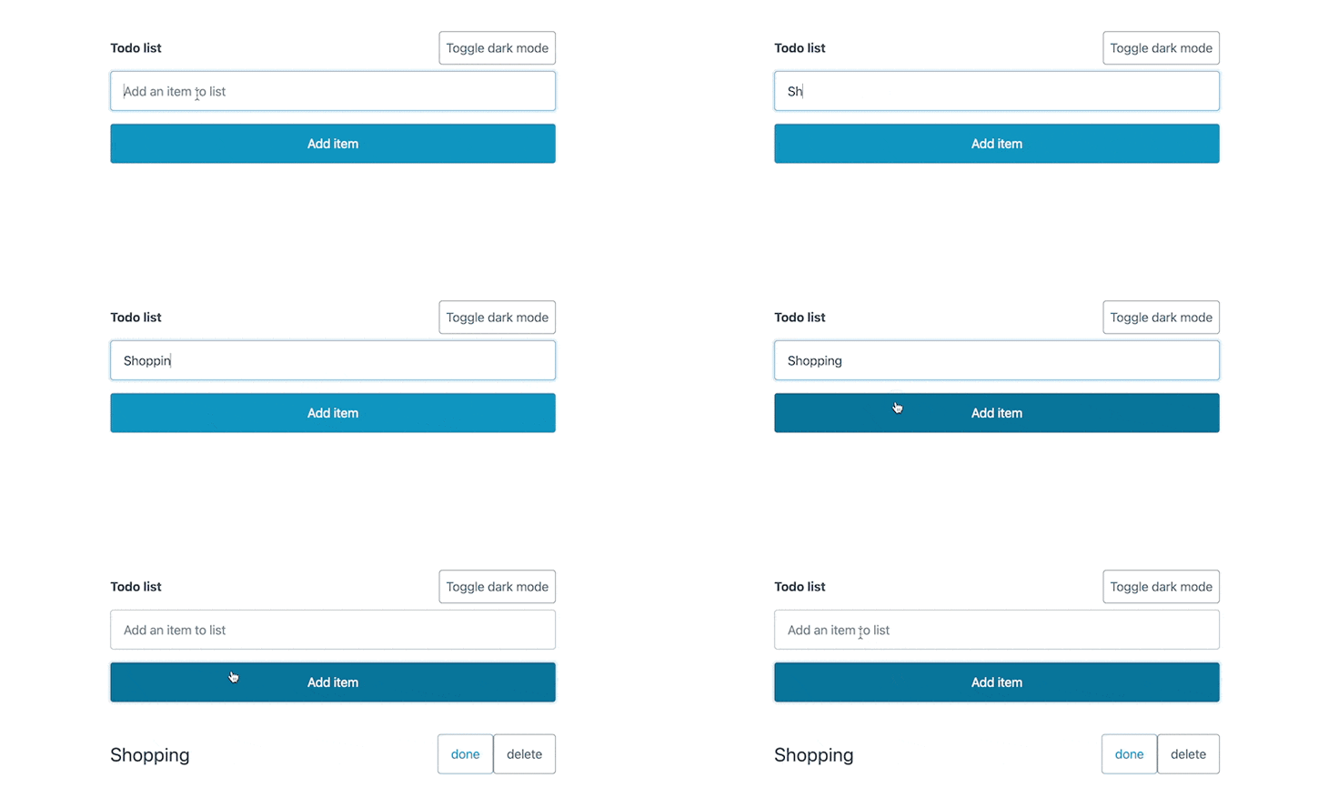
const addItem = () => { const id = Math.round(Math.random()*1000) const item = { id: id, label: newItem, done: false } setItems([...items, item]); setNewItem('')}That completes the core set of functionality that we expect from our to-do app. Here’s what that looks like:
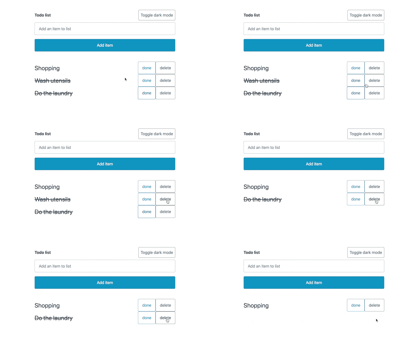
Checking off the items looks like the following:

Deleting items will look like the image below:
Dark mode support
Now that the core functionality is working as expected, let’s implement support for dark mode. We already have a placeholder button in place, so enabling dark mode in Pico CSS is as simple as passing the data-theme attribute to any element on which we want to set the theme.
It accepts two values: light and dark. We’ll set dark mode on our entire app, and therefore, we pass the attribute to the main element:
<main data-theme={theme} style={{padding: '2rem'}}>// rest of the app</main>The theme variable that we are passing to the data-theme attribute is a state variable that we’ll be toggling on the click of a button:
const [theme, setTheme] = useState('light');const toggleTheme = () => { if (theme === 'light') { setTheme('dark'); } else { setTheme('light') }}Next, we plug this toggleTheme function with the button that we have in the navbar:
<ul> <li><a href="#" role="button" className="outline secondary" onClick={toggleTheme}>Toggle dark mode</a></li></ul>With just those simple code changes, the dark mode is fully functional:
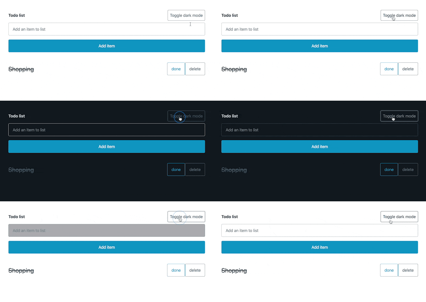
Theming
The colors that we see in both light and dark mode are the default ones provided by Pico CSS. Thankfully, we can customize the colors to suit our needs. All the default Pico CSS colors are set with CSS variables. Therefore, we just need to override these CSS variables to get the color theme that we want.
Let’s say that we’re looking to get a dark orange color scheme in light mode and the orange color scheme in dark mode. We need to set these respective colors as the --primary CSS variable:
[data-theme="light"],main:not([data-theme="dark"]) { --primary: #f4511e; --primary-hover: #ff5722; --primary-focus: rgba(244, 81, 30, 0.25); --primary-inverse: #FFF;}[data-theme="dark"],main:not([data-theme="light"]) { --primary: #fb8c00; --primary-hover: #f57c00; --primary-focus: rgba(251, 140, 0, 0.125); --primary-inverse: #FFF;}With the code above, we’ll get the following effect on the to-do app that we just developed:
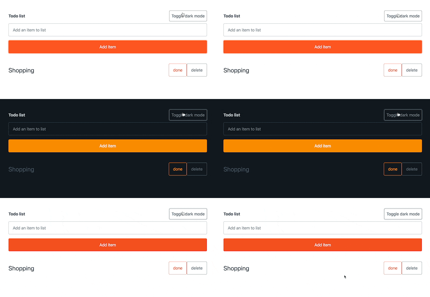
We’ve just changed the primary colors in the code blocks above, but you can customize all the variables mentioned in this file in a similar fashion.
And we’re done! With that, we have a fully functional to-do app with dark mode support and a custom color scheme.
Conclusion
In the current web development environment, where having many Tailwind classes applied to an element is a norm, Pico CSS is a breath of fresh air. In this article, we explored how to use semantic HTML with Pico CSS. This is a welcome change; all the defaults can very easily be customized, making Pico CSS a great choice for building small to medium-sized apps.
I hope you enjoyed this article! Be sure to leave a comment if you have any questions or concerns. Happy coding!
Is your frontend hogging your users' CPU?
As web frontends get increasingly complex, resource-greedy features demand more and more from the browser. If you’re interested in monitoring and tracking client-side CPU usage, memory usage, and more for all of your users in production, try LogRocket.
LogRocket is like a DVR for web and mobile apps, recording everything that happens in your web app, mobile app, or website. Instead of guessing why problems happen, you can aggregate and report on key frontend performance metrics, replay user sessions along with application state, log network requests, and automatically surface all errors.
Modernize how you debug web and mobile apps — start monitoring for free.